Last week saw the publication of the results of the “Research Excellence Framework” – a title which does almost nothing to describe what it actually is. To those reading not from academia, or from those portions of academia where this monstrosity has not penetrated, the REF involved university departments gathering sets of up to four publications from a subset of their research-active staff who were employed by them on 1st December 2013; writing submission documents to explain why those publications should be considered world-leading or at least internationally excellent; gathering and documenting “Impact” case studies, and writing about the general environment for performing research. These submissions then went to assessment panels, who did some unknowable things with them before producing assessments of the submissions: for each of the three measures (outputs, impact and environment), the percentages of that submission judged to be at particular levels, measured from 4* (world-leading) down to 0* (unclassified), and these assessments will affect in some as yet undetermined way Quality-Related funding for Higher Education Institutions (if QR funding continues at all). Those data are now published, along with, for each department, the count of full-time-equivalent research staff considered as part of the submission, and (inexplicably, about eight hours later) figures from a different higher-education agency estimating the number of staff who would have been eligible to be considered as part of each submission.
If your first reaction to all of this is “wow, that’s a well-thought-through system that will in no way become subject to Goodheart’s law”, well, I envy you your worldview. Gaming the REF starts early: since it is the employment status on 1st December 2013 that matters for the purpose of this exercise, rather than the location at which any given piece of research was done (or the address for correspondence given on the published research), economic forces quite naturally set up a transfer window, where researchers likely to score highly in the REF if included in a submission are able to name high prices for moving in the six months leading up to the census date – and there’s then much less flexibility in the academic labour market for a good year or two afterwards. Other employment distortions happen too; for example, there’s an incentive to approach researchers based outside the UK, and offer to pay them a fractional wage (say 0.2FTE) in exchange for them offering up four of their publications, assumed to be high-scoring, for submission to the UK REF. Given the way the QR funding is distributed, this is in effect a subsidy to departments with well-connected heads, and to already-successful overseas researchers.
But aside from the distortions that arise from producing the submissions, and the simultaneously unclear and opaque way that judgment on those submissions is made, at least the result of all of this is a table of numbers, which don’t lie, right? Right.
No.
I happened to be in a different country on REF results day, doing different work. So my main view of what was going on was following the #REF2014 twitter stream. And maybe I envy myself my previous worldview, because I was not prepared for the deluge of mendaciousness. I don’t know what I was expecting – a discussion between academics, maybe, or a quick dissection of the figures, and some links to news articles and blog posts. What I actually got was corporate account after account claiming victory in the REF, using various ways of weighting and ordering the measures. Particularly egregious examples included:
failing to distinguish between case studies and overall research, typically seen in “x% of our research has world-class impact” or similar: @unisouthampton @cardiffphilos @ITSLeeds @UWEGradSchool @LancasterManage
talking about “research power”, which multiplies a GPA-type score by the FTE quantity of staff submitted to the assessment. By introducing this, larger institutions can successfully confound a notional measure of quality with a measure of quantity to produce something essentially meaningless (except that it will likely be some similar formula which determines QR funding – but most University costs are per-capita costs anyway, so this still doesn’t make much sense): @LawLeicester @CityUniHealth @UniofReading @EconomicsatYork @UoNresearch @ScienceLeeds
simple gibberish: @CovUniResearch, and the Guardian gets a special prize for attempting to use the REF to compare apples to oranges.
It was also disappointing to see corporate twitter accounts attempting to find measures to optimize their ranking positions after the fact; John O’Leary has observed that at least four institutions have claimed overall “victory”, as if one institution’s research could defeat another’s. As well as overall victory, though, a seemingly-infinite number of departmental accounts claimed victory, or a top-ten position, or a top-twenty (or 16th, or 22nd, or 66th) as if that was meaningful. Do we really believe that the panels, in all their wisdom, can assess the difference between “internationally excellent” and “world-leading” to a sufficient accuracy that differences in GPA scores in the third significant place are meaningful? In other words, where are the error bars on these measurements?
To finish up: I spent too long today downloading the HEFCE and HESA data, cleaning it up, swearing at UCL’s acquisition of the Institute of Education, and messing around with ggplot. I hope to publish the cleaned-up data files for others to play with in the holidays; in the meantime, I leave you with this illustration of the game-playing: since there are multiple outcomes from one set of REF measurements, different institutions will have used different strategies for choosing which of their staff to submit and which not: to attempt to optimize their Grade Point Average, their (hoped-for) QR funding, or their likelihood of a good headline on 18th December 2014. We can measure some of that by looking at the difference between GPA scores, and GPA scores scaled by the proportion of eligible staff who were actually submitted. To illustrate that, I’ve made a Tufte-style slopegraph; the only concession to modernity is that the steeper the slope, the darker the ink of the line. (Modernity in character encoding – sorry, Glyndŵr University – and font-antialiasing is completely unaddressed).
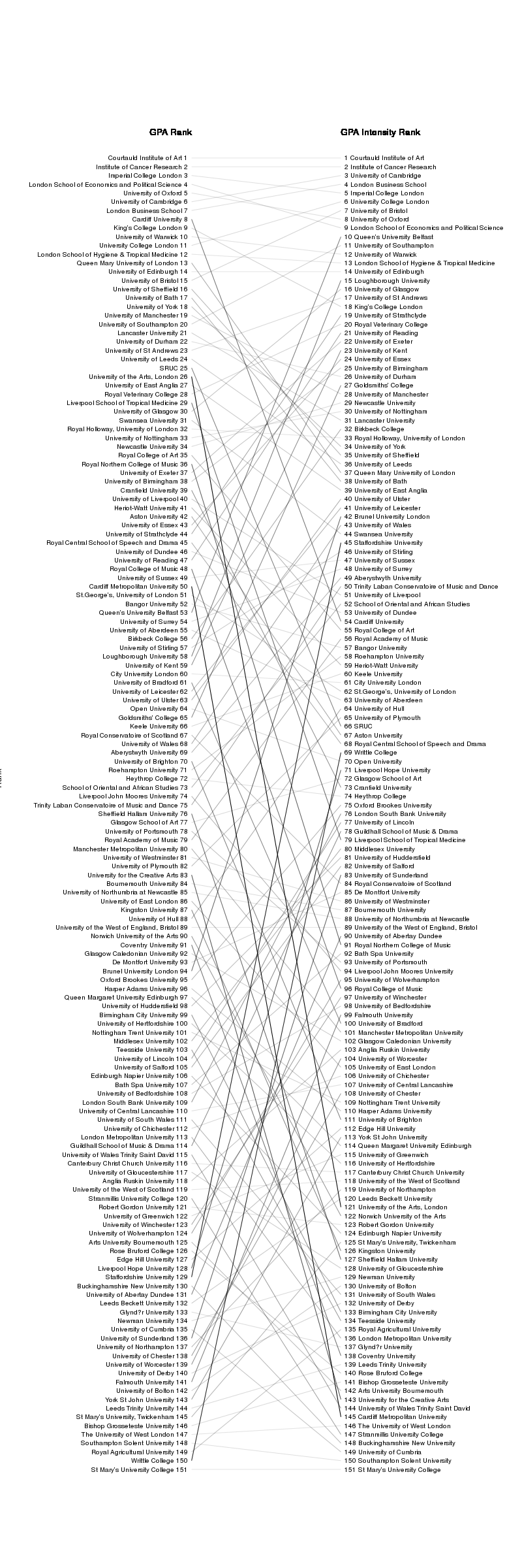
You can decide whether either of the GPA measures is more or less meaningful; I have no particular axe to grind (though I suspect that my institution might, and on balance I think they are on the side of the angels who know how to dance slightly better on the head of a pin). One message this graph tells that everyone should be able to agree on is that it illustrates different strategies being employed – if there were uniformity across the sector, the lines would be generally horizontal. (And the real tragedy of all this is that clever, dedicated people at institutions of research and learning spent actual time and energy thinking about REF submission strategies, instead of doing something interesting and potentially useful).
In some sense, I hope not to come back to this subject. But it’s the holidays, and I need something that seems enough like work avoidance that it will distract me from preparing my lectures for next term...