I went to londonR a month or so ago, and the talk whose content stayed with me most was the one given by Simon Hailstone on map-making and data visualisation with ggplot2. The take-home message for me from that talk was that it was likely to be fairly straightforward to come up with interesting visualisations and data mashups, if you already know what you are doing.
Not unrelatedly, in the Goldsmiths Data Science MSc programme which we are running from October, it is quite likely that I will be teaching a module in Open Data, where the students will be expected to produce visualisations and mashups of publically-accessible open data sets.
So, it is then important for me to know what I am doing, in order that
I can help the students to learn to know what they are doing. My
first, gentle steps are to look at life in London; motivated at least
partly by the expectation that I encounter when dropping off or
picking up children from school that I need more things to do with my
time (invitations to come and be trained in IT at a childrens' centre
at 11:00 are particularly misdirected, I feel) I was interested to try
to find out how local employment varies. This blog serves at least
partly as a stream-of-exploration of not just the data but also
ggplot and gridsvg; as a (mostly satisfied) user of lattice and
SVGAnnotation in a previous life, I'm
interested to see how the R graphing tools have evolved.
Onwards! Using R 3.1 or later: first, we load in the libraries we will need.
library(ggplot2)
library(extremevalues)
library(maps)
library(rgeos)
library(maptools)
library(munsell)
library(gridSVG)
Then, let's define a couple of placeholder lists to accumulate related data structures.
london <- list()
tmp <- list()
Firstly, let's get hold of some data. I want to look at employment; that means getting hold of counts of employed people, broken down by area, and also counts of people living in that area in the first place. I found some Excel spreadsheets published by London datastore and the Office for National Statistics, with data from the 2011 census, and extracted from them some useful data in CSV format. (See the bottom of this post for more detail about the data sources).
london$labour <- read.csv("2011-labour.csv", header=TRUE, skip=1)
london$population <- read.csv("mid-2011-lsoa-quinary-estimates.csv", header=TRUE, skip=3)
The labour information here does include working population counts by area – specifically by Middle Layer Super Output Area (MSOA), a unit of area holding roughly eight thousand people. Without going into too much detail, these units of area are formed by aggregating Lower Layer Super Output Areas (LSOAs), which themselves are formed by aggregating census Output Areas. In order to get the level of granularity we want, we have to do some of that aggregation ourselves.
The labour data is published in one sheet by borough (administrative area), ward (local electoral area) and LSOA. The zone IDs for these areas begin E09, E05 and E01; we need to manipulate the data frame we have to include just the LSOA entries
london$labour.lsoa <- droplevels(subset(london$labour, grepl("^E01", ZONEID)))
and then aggregate LSOAs into MSOAs “by hand”, by using the fact that LSOAs are named such that the name of their corresponding MSOA is all but the last letter of the LSOA name (e.g. “Newham 001A” and “Newham 001B” LSOAs both have “Newham 001” as their parent MSOA). In doing the aggregation, all the numeric columns are count data, so the correct aggregation is to sum corresponding entries of numerical data (and discard non-numeric ones)
tmp$nonNumericNames <- c("DISTLABEL", "X", "X.1", "ZONEID", "ZONELABEL")
tmp$msoaNames <- sub(".$", "", london$labour.lsoa$ZONELABEL)
tmp$data <- london$labour.lsoa[,!names(london$labour.lsoa) %in% tmp$nonNumericNames]

london$labour.msoa <- aggregate(tmp$data, list(tmp$msoaNames), sum)
tmp <- list()
The population data is also at LSOA granularity; it is in fact for all LSOAs in England and Wales, rather than just London, and includes some aggregate data at a higher level. We can restrict our attention to London LSOAs by reusing the zone IDs from the labour data, and then performing the same aggregation of LSOAs into MSOAs.
london$population.lsoa <- droplevels(subset(london$population, Area.Codes %in% levels(london$labour.lsoa$ZONEID)))
tmp$nonNumericNames <- c("Area.Codes", "Area.Names", "X")
tmp$msoaNames <- sub(".$", "", london$population.lsoa$X)
tmp$data <- london$population.lsoa[,!(names(london$population.lsoa) %in% tmp$nonNumericNames)]
london$population.msoa <- aggregate(tmp$data, list(tmp$msoaNames), sum)
tmp <- list()
This is enough data to be getting on with; it only remains to join the data frames up. The MSOA name column is common between the two tables; we can therefore reorder one of them so that it lines up with the other before simply binding columns together:
london$employment.msoa <- cbind(london$labour.msoa, london$population.msoa[match(london$labour.msoa$Group.1, london$population.msoa$Group.1)])
(In practice in this case, the order of the two datasets is the same, so the careful reordering is in fact the identity transformation)
tmp$notequals <- london$population.msoa$Group.1 != london$labour.msoa$Group.1
stopifnot(!sum(tmp$notequals))
tmp <- list()
Now, finally, we are in a position to look at some of the data. The population data contains a count of all people in the MSOA, along with counts broken down into 5-year age bands (so 0-5 years old, 5-10, and so on, up to 90+). We can take a look at the proportion of each MSOA's population in each age band:
ggplot(reshape(london$population.msoa, varying=list(3:21),
               direction="long", idvar="Group.1")) +
    geom_line(aes(x=5*time-2.5, y=X0.4/All.Ages, group=Group.1),
              alpha=0.03, show_guide=FALSE) +
    scale_x_continuous(name="age / years") +
    scale_y_continuous(name="fraction") +
    theme_bw()
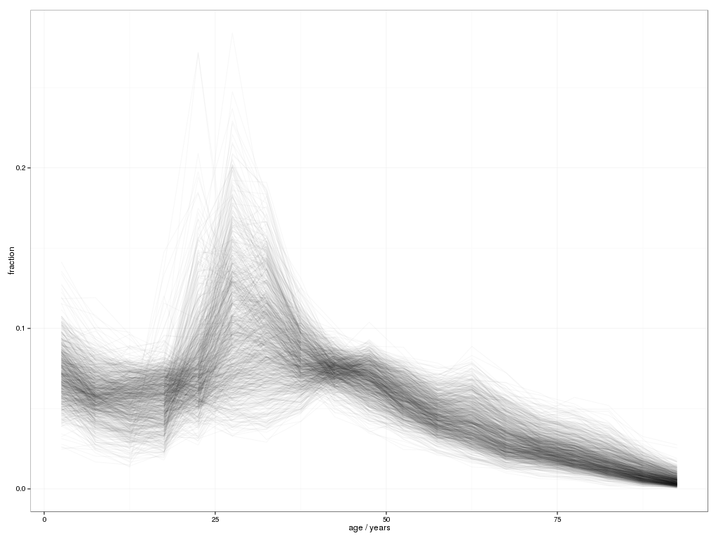
This isn't a perfect visualisation; it does show the broad overall shape of the London population, along with some interesting deviations (some MSOAs having a substantial peak in population in the 20-25 year band, while rather more peak in the 25-30 band; a concentration around 7% of 0-5 year olds, with some significant outliers; and a tail of older people with some interesting high outliers in the 45-50 and 60-65 year bands, as well as one outlier in the 75-80 and 80-85).
That was just population; what about the employment statistics? Here's a visualisation of the fraction of people in full-time employment, treated as a distribution
ggplot(london$employment.msoa, aes(x=Full.time/All.Ages)) +
    geom_density() + theme_bw()
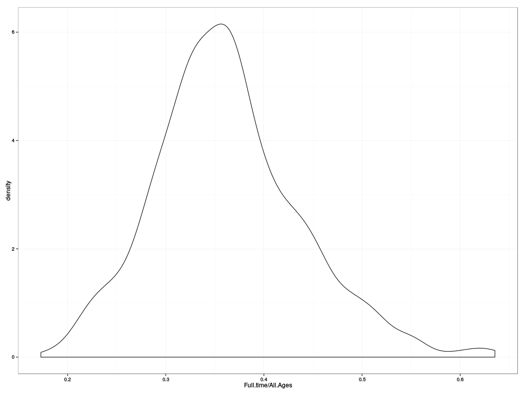
showing an overal concentration of full-time employment level around 35%. But this of course includes in the population estimate people of non-working ages; it may be more relevant to view the distribution of full-time employment as a fraction of those of “working age”, which here we will define as those between 15 and 65 (not quite right but close enough):
london$employment.msoa$younger = rowSums(london$employment.msoa[,62:64])
london$employment.msoa$older = rowSums(london$employment.msoa[,75:80])
ggplot(london$employment.msoa, aes(x=Full.time/(All.Ages-younger-older))) +
    geom_density() + theme_bw()
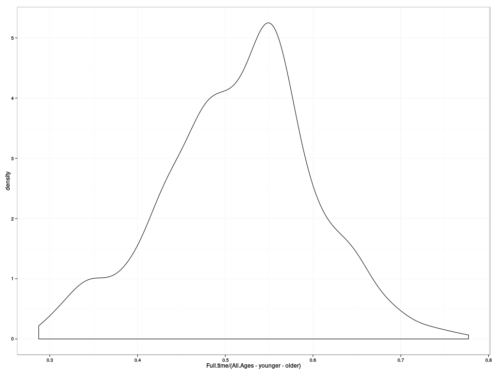
That's quite a different picture: we've lost the bump of outliers of high employment around 60%, and instead there's substantial structure at lower employment rates (plateaus in the density function around 50% and 35% of the working age population). What's going on? The proportions of people not of working age must not be evenly distributed between MSOAs; what does it look like?
ggplot(london$employment.msoa, aes(x=older/All.Ages, y=younger/All.Ages)) +
    geom_point(alpha=0.1) + geom_density2d() + coord_equal() + theme_bw()
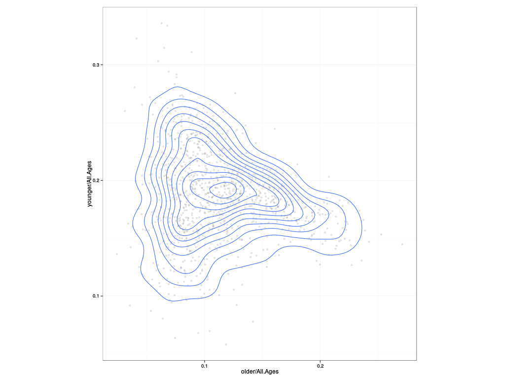
So here we see that a high proportion of older people in an MSOA (around 20%) is a strong predictor of the proportion of younger people (around 17%); similarly, if the younger population is 25% or so of the total population, there are likely to be less than 10% of people of older non-working ages. But at intermediate values of either older or younger proportions, 10% of older or 15% of younger, the observed variation of the other proportion is very high: what this says is that the proportion of people of working age in an MSOA varies quite strongly, and for a given proportion of people of working age, some MSOAs have more older people and some more younger people. Not a world-shattering discovery, but important to note.
So, going back to employment: what are the interesting cases? One way
of trying to characterize them is to fit the central portion of the
observations to some parameterized distribution, and then examining
cases where the observation is of a sufficiently low probability. The
extremevalues R package does some of this for us; it offers the
option to fit a variety of distributions to a set of observations with
associated quantiles. Unfortunately, the natural distribution to use
for proportions, the Beta distribution, is not one of the options
(fitting involves messing around with derivatives of the inverse of
the incomplete Beta function, which is a bit of a pain), but we
can cheat: instead of doing the reasonable thing and fitting a beta
distribution, we can transform the proportion using the logit
transform and fit a Normal distribution instead, because everything is
secretly a Normal distribution. Right? Right? Anyway.
tmp$outliers <- with(london$employment.msoa, getOutliers(log(Full.time/All.Ages/(1-Full.time/All.Ages))))
tmp$high <- london$employment.msoa$Group.1[tmp$outliers$iRight]
tmp$low <-london$employment.msoa$Group.1[tmp$outliers$iLeft]
print(tmp[c("high", "low")])
tmp <- list()
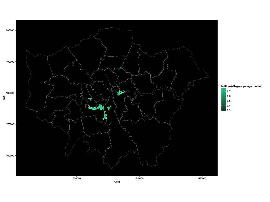
This shows up 9 MSOAs as having a surprisingly high full employment
rate, and one (poor old Hackney 001) as having a surprisingly low
rate (where “surprising” is defined relative to our
not-well-motivated-at-all Normal distribution of logit-transformed
full employment rates, and so shouldn't be taken too seriously).
Where are these things? Clearly the next step is to put these MSOAs
on a map. Firstly, let's parse some shape files (again, see the
bottom of this post for details of where to get them from).
london$borough <- readShapePoly("London_Borough_Excluding_MHW")
london$msoa <- readShapePoly("MSOA_2011_London_gen_MHW")
In order to plot these shape files using ggplot, we need to convert
the shape file into a “fortified” form:
london$borough.fortified <- fortify(london$borough)
london$msoa.fortified <- fortify(london$msoa)
and we will also need to make sure that we have the MSOA (and borough) information as well as the shapes:
london$msoa.fortified$borough <- london$msoa@data[as.character(london$msoa.fortified$id), "LAD11NM"]
london$msoa.fortified$zonelabel <- london$msoa@data[as.character(london$msoa.fortified$id), "MSOA11NM"]
For convenience, let's add to the “fortified” MSOA data frame the columns that we've been investigating so far:
tmp$is <- match(london$msoa.fortified$zonelabel, london$employment.msoa$Group.1)
london$msoa.fortified$fulltime <- london$employment.msoa$Full.time[tmp$is]
london$msoa.fortified$allages <- london$employment.msoa$All.Ages[tmp$is]
london$msoa.fortified$older <- london$employment.msoa$older[tmp$is]
london$msoa.fortified$younger <- london$employment.msoa$younger[tmp$is]
And now, a side note about R and its evaluation semantics. R
has... odd semantics. The basic evaluation model is that function
arguments are evaluated lazily, when the callee needs them, but in the
caller's environment – except if the argument is a defaulted one (when
no argument was actually passed), in which ase it's in the callee's
environment active at the time of evaluation, except that these rules
can be subverted using various mechanisms, such as simply looking at
the call object that is currently being evaluated. There's
significant complexity lurking, and libraries like ggplot (and
lattice, and pretty much anything you could mention) make use of
that complexity to give a convenient surface interface to their
functions. Which is great, until the time comes for someone to write
a function that calls these libraries, such as the one I'm about to
present which draws pictures of London. I have to know about the
evaluation semantics of the functions that I'm calling – which I
suppose would be reasonable if there weren't quite so many possible
options – and necessary workarounds that I need to install so that
my function has the right, convenient evaluation semantics while
still being able to call the library functions that I need to. I can
cope with this because I have substantial experience with programming
languages with customizeable evaluation semantics; I wonder how to
present this to Data Science students.
With all that said, I present a fairly flexible function for drawing bits of London. This presentation of the finished object of course obscures all my exploration of things that didn't work, some for obvious reasons and some which remain a mystery to me.
ggplot.london <- function(expr, subsetexpr=TRUE) {
We will call this function with an (unevaluated) expression to be
displayed on a choropleth, to be evaluated in the data frame
london$msoa.fortified, and an optional subsetting expression to
restrict the plotting. We compute the range of the expression,
independent of any data subsetting, so that we have a consistent scale
between calls
expr.limits <- range(eval(substitute(expr), london$msoa.fortified))
and compute a suitable default aesthetic structure for ggplot
expr.aes <- do.call(aes, list(fill=substitute(expr), colour=substitute(expr)))
where substitute is used to propagate the convenience of an
expression interface in our function to the same expression interface
in the ggplot functions, and do.call is necessary because aes does
not evaluate its arguments, while we do need to perform the
substitution before the call.
london.data <- droplevels(do.call(subset, list(london$msoa.fortified, substitute(subsetexpr))))
This is another somewhat complicated set of calls to make sure that
the subset expression is evaluated when we need it, in the environment
of the data frame. london.data at this point contains the subset of
the MSOAs that we will be drawing.
(ggplot(london$borough.fortified) + coord_equal() +
Then, we set up the plot, specify that we want a 1:1 aspect ratio,
     (theme_minimal() %+replace%
      theme(panel.background = element_rect(fill="black"),
            panel.grid.major = element_blank(),
            panel.grid.minor = element_blank())) +
a black background with no grid lines,
geom_map(map=london.data, data=london.data, modifyList(aes(map_id=id, x=long, y=lat), expr.aes), label="map") +
and plot the map.
     scale_fill_gradient(limits=expr.limits, low=mnsl2hex(darker(rgb2mnsl(coords(hex2RGB("#13432B", TRUE))))), high=mnsl2hex(darker(rgb2mnsl(coords(hex2RGB("#56F7B1", TRUE)))))) +
     scale_colour_gradient(limits=expr.limits, low="#13432B", high="#56F7B1", guide=FALSE) +
We specify a greenish colour scale, with the fill colour being slightly darker than the outline colour for prettiness, and
geom_map(map=london$borough.fortified, aes(map_id=id, x=long, y=lat), colour="white", fill=NA, size=0.1)
also draw a superposition of borough boundaries to help guide the eye.
     )
}
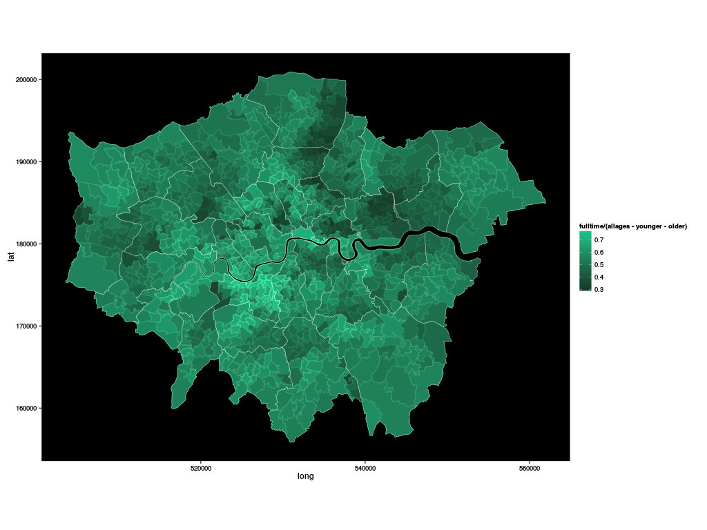
So, now, we can draw a map of full time employment:
ggplot.london(fulltime/(allages-younger-older))
or the same, but just the outlier MSOAs:
ggplot.london(fulltime/(allages-younger-older), zonelabel %in% london$outliers)
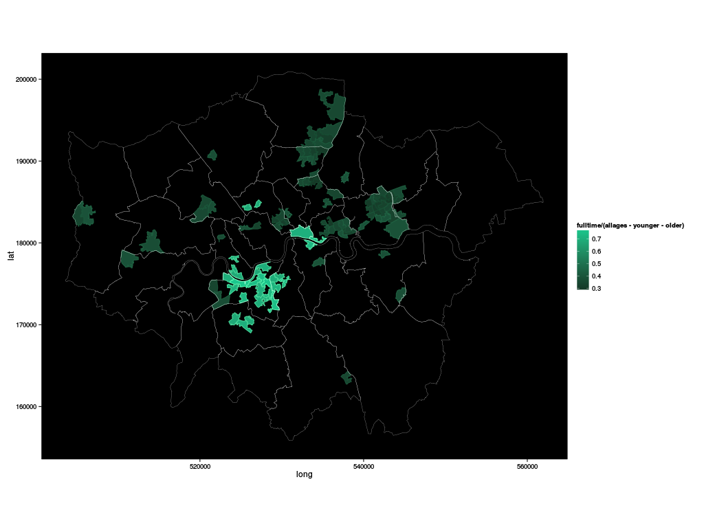
or the same again, plotting only those MSOAs which are within 0.1 of the extremal values:
ggplot.london(fulltime/(allages-younger-older), pmin(fulltime/(allages-younger-older) - min(fulltime/(allages-younger-older)), max(fulltime/(allages-younger-older)) - fulltime/(allages-younger-older)) < 0.1)
Are there take-home messages from this? On the data analysis itself, probably not; it's not really a surprise to discover that there's substantial underemployment in the North and East of London, and relatively full employment in areas not too far from the City of London; it is not unreasonable for nursery staff to ask whether parents dropping children off might want training; it might be that they have the balance of probabilities on their side.
From the tools side, it seems that they can be made to work;
I've only really been kicking the tyres rather than pushing them hard,
and the number of times I had to rewrite a call to ggplot, aes or
one of the helper functions as a response to an error message,
presumably because of some evaluation not happening at quite the right
time, is high – but the flexibility and interactivity they offer for
exploration feels to me as if the benefits outweigh the costs.
The R commands in this post are here; the shape files are extracted from Statistical GIS Boundary Files for London and redistributed here under the terms of the Open Government Licence; they contain National Statistics and Ordnance Survey data © Crown copyright and database right 2012. The CSV data file for population counts is derived from an ONS publication, distributed here under the terms of the Open Government Licence, and contains National Statistics data © Crown copyright and database right 2013; the CSV data file for labour statistics is derived from a spreadsheet published by the London datastore, distributed here under the terms of the Open Government Licence, and contains National Statistics data © Crown copyright and database right 2013.
Still here after all that licence information? I know I promised some
gridSVG evaluation too, but it's getting late and I've been drafting
this post for long enough already. I will come back to it, though,
because it was the more fun bit, and it makes some nifty interactive
visualizations fairly straightforward. Watch this space.